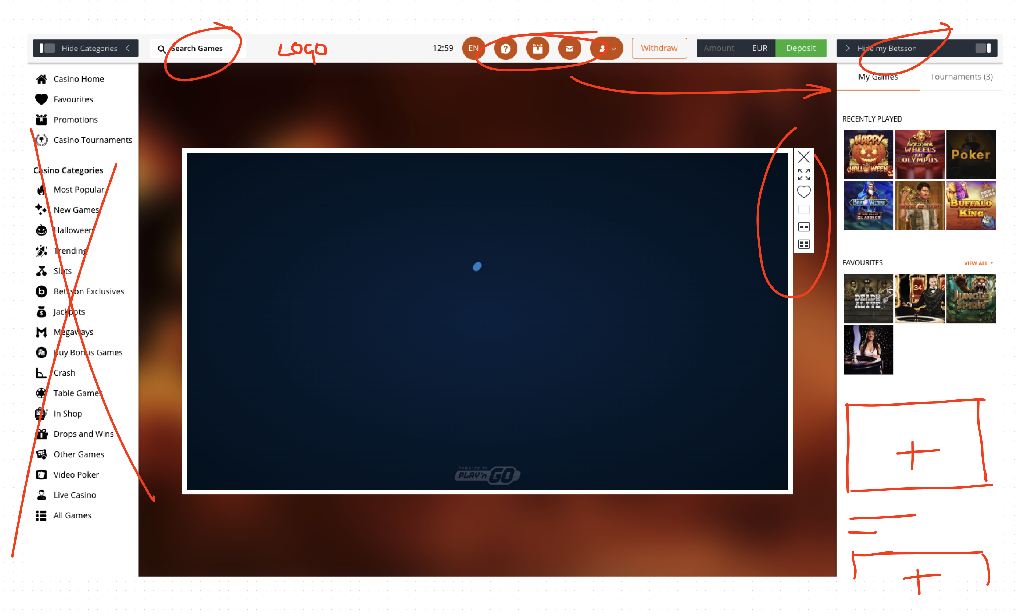
- Outdated UI aesthetic
- Players are required to exit for game discovery
- Search not prominent enough
- Left menu is distracting
- Clunky and slow to use

Whilst we had redesigned the gameplay screen for our desktop product as part of the company’s ‘OBG’ strategy, we’d rushed out an MVP for launch and the site was certainly not as pretty as we’d have liked it to be. New acquisitions become the focus for the company and polishing our core product was abandoned in favour of adding new brands to the platform. The result of this was a site desperately in need of a facelift. The was especially concerning when factoring in that this is where our players spend ninety percent or more of their time and where maximum engagement is desired.
Feedback from our users during the OBG Platform project was already out of date, but at least we knew what our users liked and what they didn’t from our current offering. We were also able to lean on other brands sitting under the Betsson Group umbrella that offered a different UX, and gain insights from them on what worked.
The first step was to have a look around and see what our competitors were doing, as well as some smaller but more cutting edge casinos that could provide inspiration and give us some idea on how we might integrate more novel features.
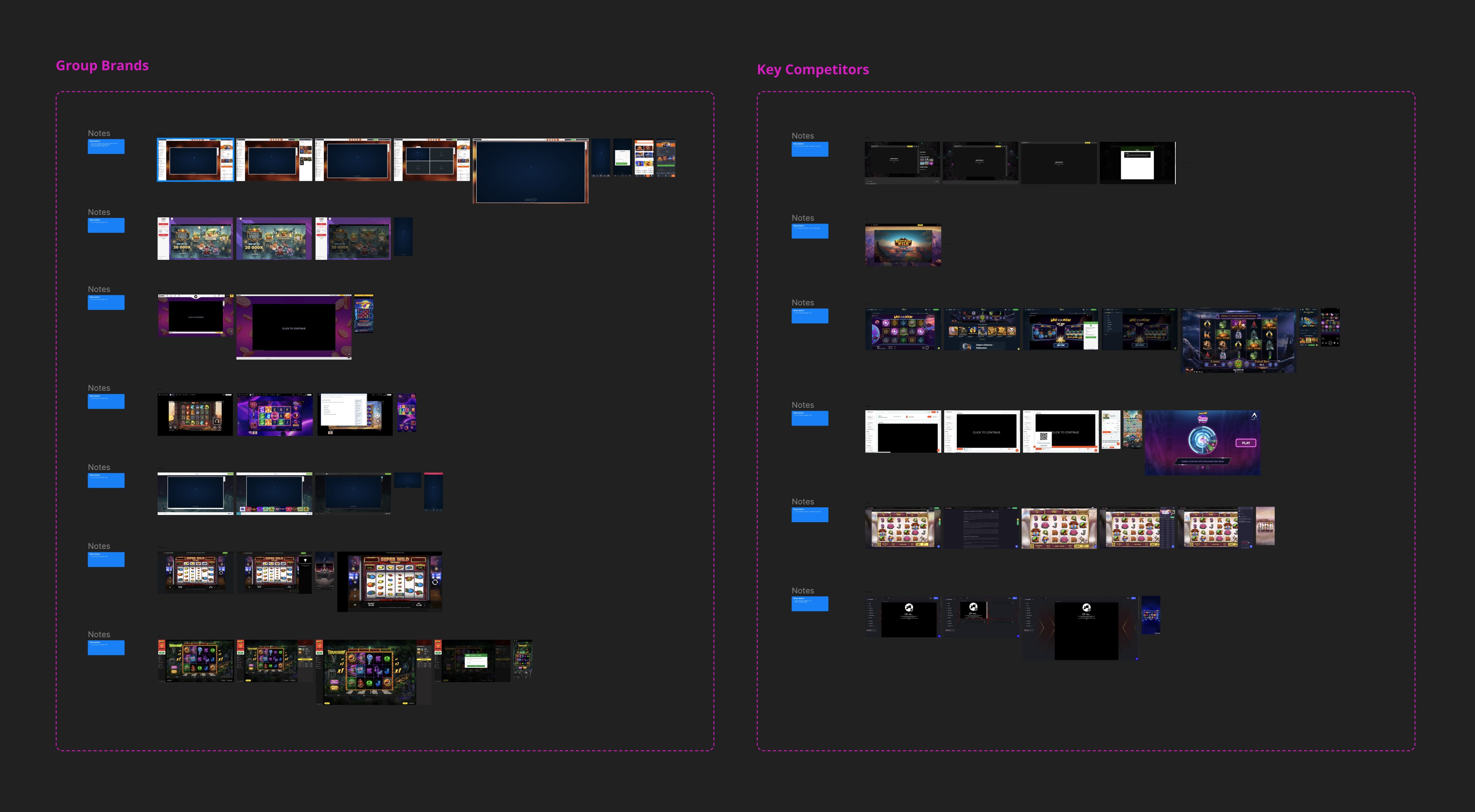
A complete redesign can creates issues including unsettling existing users, particularly the loyal customer base that has been playing with same casino product for months or even years. It is better to identify key weakness in the site, and improve the existing components, and their layout, while rolling out new features to improve the experience.
- Improve visual aesthetic of gameplay UI
- Retain approximate page layout so as not to upset players familiar with current user experience
- Remove left menu – it adds little and encourages players to end their game
- Reorganise top level navigation
- Make search more prominent
- Clean up right sidebar navigation
- Incorporate new thumbnail modules to expand on ‘lobby in sidebar’ functionality
- Dark UI for all brands – focus on game
Key areas requiring improvement.
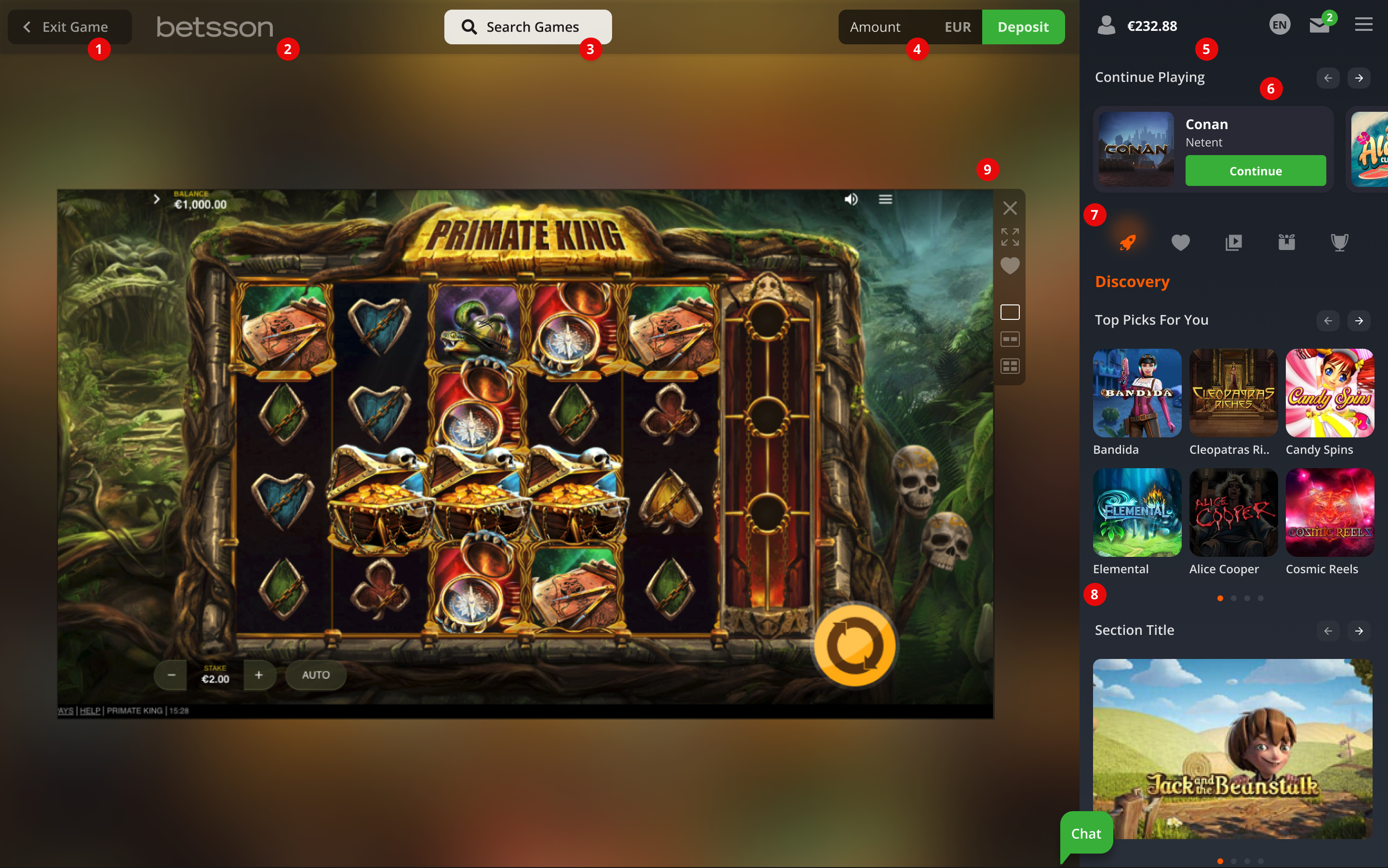
Key for updated and new features:
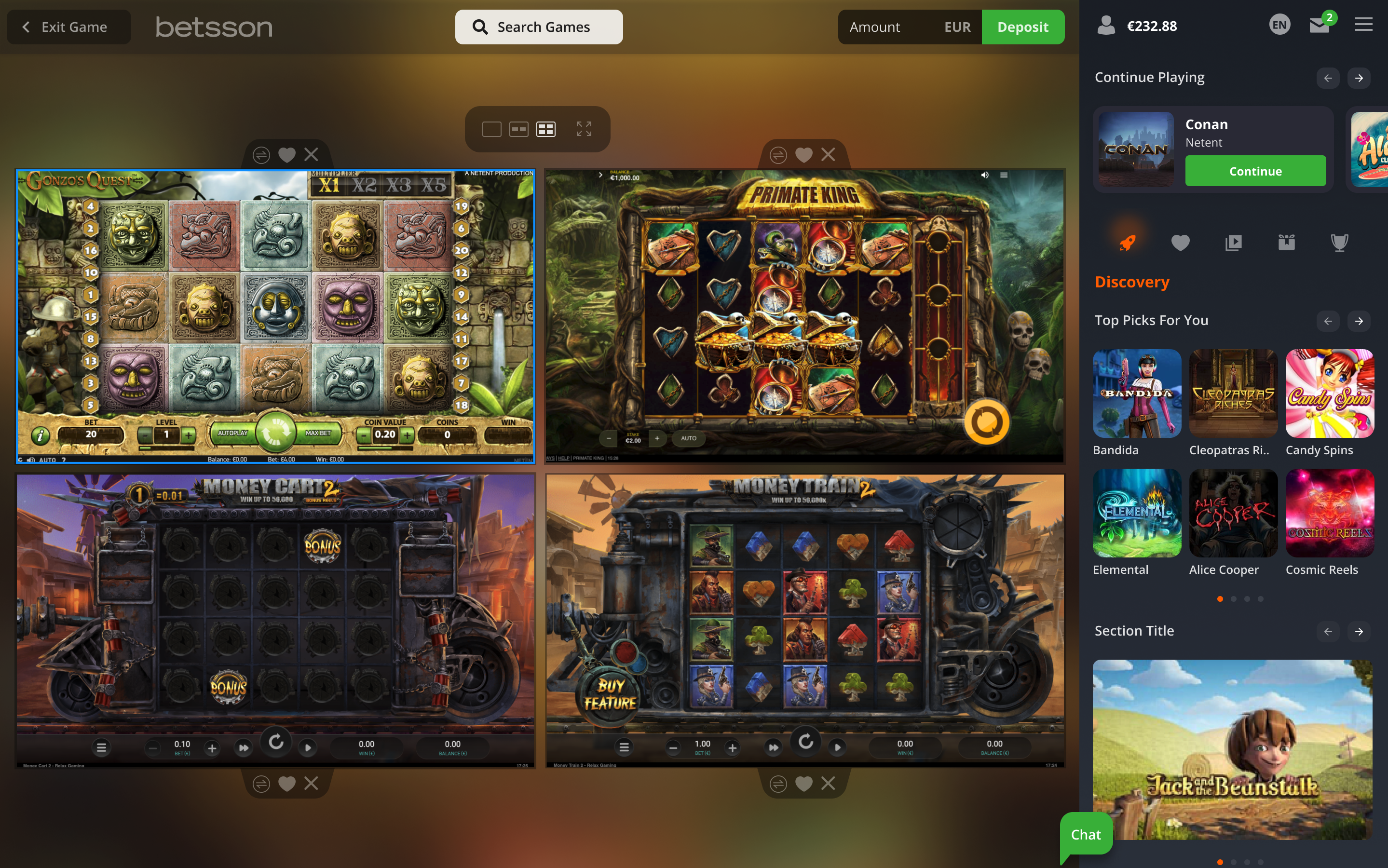
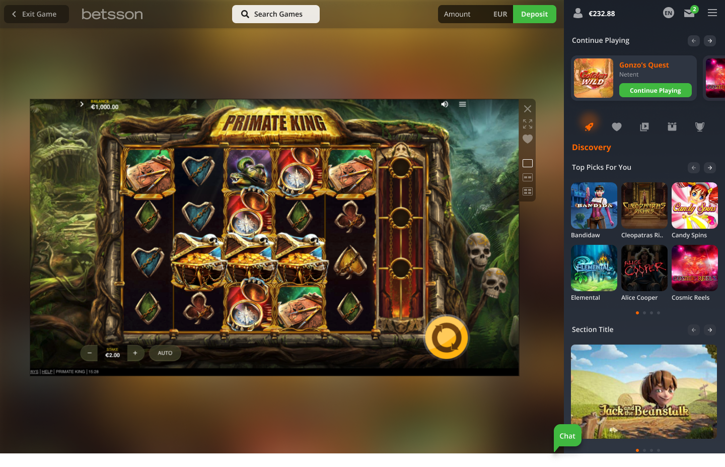
- Remove left sidebar and insert clear Exit Game button to allow user to return to the lobby
- Add brand logo
- Prominent Search CTA
- Quick Deposit feature accessible at all times
- Tidy up remaining top bar links into new account related navigation bar
- Enhanced ‘Continue Playing’ feature
- Sidebar tab menu which now includes Discovery, plus Promotions
- New category ‘Discovery’ for quick, lobby-like game offering, and incorporating new global modules for game collections
- Slicker game window and controls
The game Multiplay mode UI was also much improved.
