The Challenge

To streamline the Betsson Group product offering

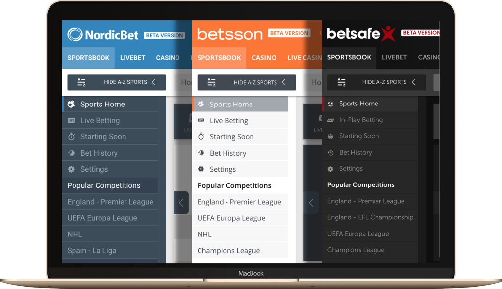
Betsson Group PLC is an established online gambling company that offers multiple products, including sports betting, casino games, and online poker, representing over 20 brands operating in 19 jurisdictions. With an ever increasing number of brand acquisitions, it became clear we needed to streamline our product offering so that one platform could support multiple brands in multiple markets.

This was a long term project that took over 3 years including the mobile product.

Operational Requirement

  • Simplify development process
  • Reduce operational cost
  • Increase efficiency
  • Faster feature roll out
User Need

  • Find games more easily
  • More features
  • Better overall user experience
  • Retain brand familiarity
Betsson

Strategy

Create a comprehensive platform for Betsson Group’s gaming products for desktop and mobile devices (this case study will focus on the casino for desktop). Initially, the platform would support the company’s three leading brands, integrating the unique features of each brand, plus increasing efficiency and profitability of Betsson’s product development process.

Approach

After conducting a UX audit, we would be able to identify the key issues. We would gather as much data as possible, from existing research, and conduct interviews with users. Key stakeholders would also provide input
My Role

UX / UI Designer

The Team

UX Manager
UX Lead
UX / UI Designer

Tools

Sketch
Photoshop
Adobe XD

Timeline

OBG Mobile 8 months
OBG Desktop 2+ years
2017-2020

Contribution

Concept Ideation
Prototyping

It’s important to note that at the earliest stage we had around 7-8 UX Designers involved in the brainstorming process, with weekly discussions set up between us and tech to review wireframes. It was my role to take our collaborated vision, create wireframes, and subsequently reiterate the designs.

However, after a substantial company restructure, we were left as 3 designers on this project, and much of the initial ideation was scrapped. For the most part, the work was undertaken by me as UI / UX Designer as well as our Lead UX Designer.

Empathise

User Research

At the time, we’d only very recently rolled out our new mobile casino, which set the groundwork to some degree for the ‘full fat’ desktop casino. I was significantly involved in that project as well as a UI designer. The brief was similar in that it would form the base platform for multiple casino brands, however the desktop version was a much more complex product and at that time was the key touch point for the vast majority of our users.
Before we were able to begin formulating ideas of how the new casino would look and behave, we would need to lean on other departments in the organisation to provide us with data and research.
UX Research Process

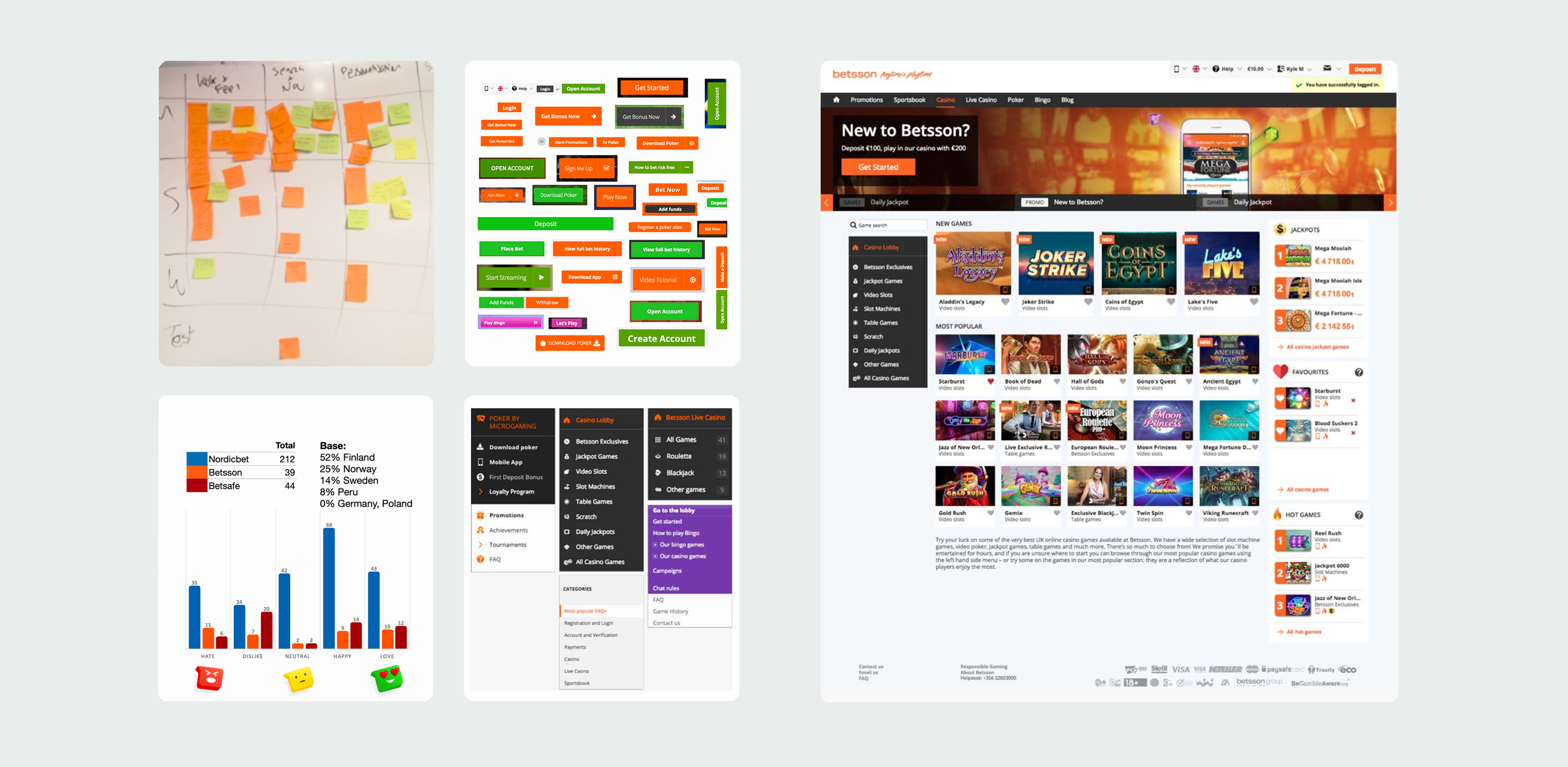
  • UX audit of existing site
  • Key stakeholder Input
  • Data dive
  • Remote usability study
  • Revisit existing research (CX trackers, heat maps, VoC, etc)
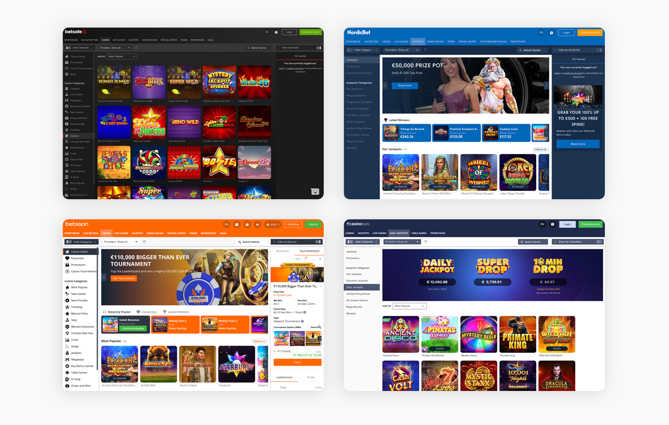
  • Competitor Analysis
This would help us to identify customer pain points and requirements, pathing the way for us to build the foundations for a vastly improved, user focussed casino product.
The recent mobile site build had already provided us with a new navigational structure and category groupings, and helped us streamline features for a multibrand MVP. There were, however, significant issues that needed addressing specifically for the desktop product.
Define

Product Features

Weaknesses Identified

  • Visual appearance outdated
  • Navigation poor
  • Search basic and does not achieve desired result
  • Filtering non-existent
  • No personalisation available
  • My Account area extremely confusing
  • Looks like a different website completely from other products
  • Lobby features not accessible from gameplay area
  • Thumbnails small and not enticing

We split the product experience into 6 defined areas, which collectively make up the site as a whole. Within each area we identified the weaknesses in existing features, missing features that would improve the product overall, and each area would be given a much prettier UI treatment.

The tech team would also be working hard to make improvements to the site performance as well.

Lobby
Create a Netflix style content offering. We would need better designed and larger game tiles, organised into categories and collections to make it easier for the user to find the games they like. Game information should be more clearly visible and navigation vastly improved.
Gameplay
More viewport options, a mini lobby to increase player engagement during gameplay, quick deposit, tournaments, access to account area and quick deposit
Sidebars
Design inherited from the sportsbook. Navigation to sit in the left sidebar, right sidebar will be available also for new features such as tournaments and missions, plus favourites, promotions and recently played.
Account
Deliver fullscreen account area, with sections for profile, bonuses, messages, transaction history. Make it simple to navigate and understand
Promotions
Having been previously limited to a small area in messages, we would dedicate a whole page to bonus offers and promotions. They in turn would like to a dedicated one pager for each promotion, linking through the applicable games.
Search
The new search would be full screen, and have a much improved logic. You would be able to search for providers as well as games, and access the search from multiplay
Ideate

Wireframing and Prototyping

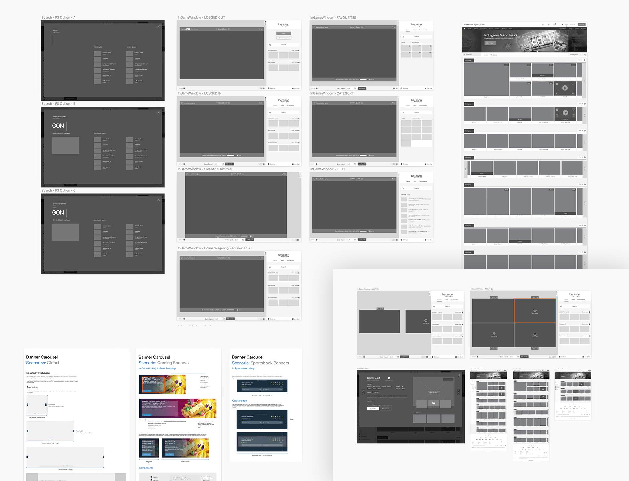
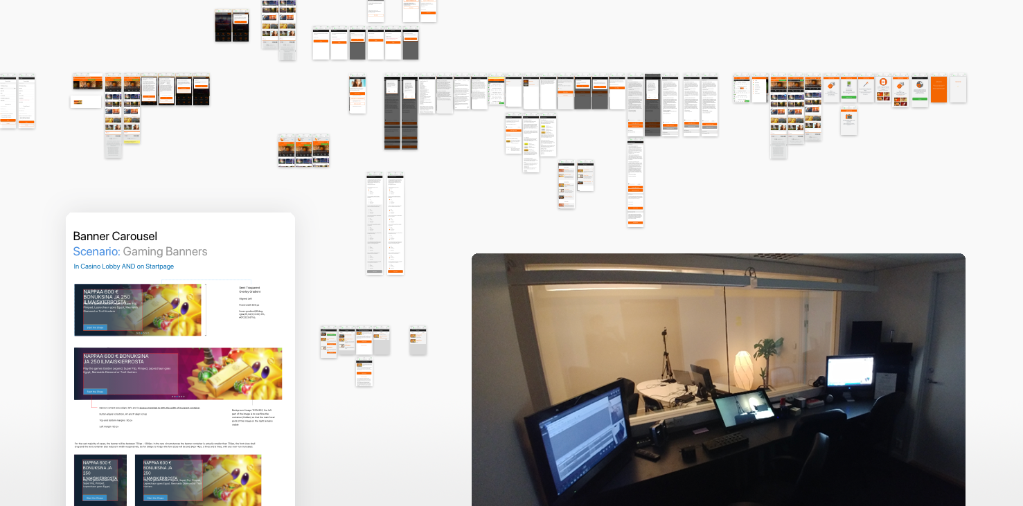
From this point we were three designers. Weekly sprints were set up with the development to review the wireframes. Generally we would begin designing a feature from wireframe in Sketch. From here we would move to high fidelity prototypes presented in Invision, beginning with just one brand, Nordicbet.

For the entirety of the project we used Sketch to design, and Invision to prototype, working through the feature list. We engaged in weekly sprints and refinements with development, while at the same time ensuring our design decisions met with the requirements of the commercial teams.

Execution

Design System

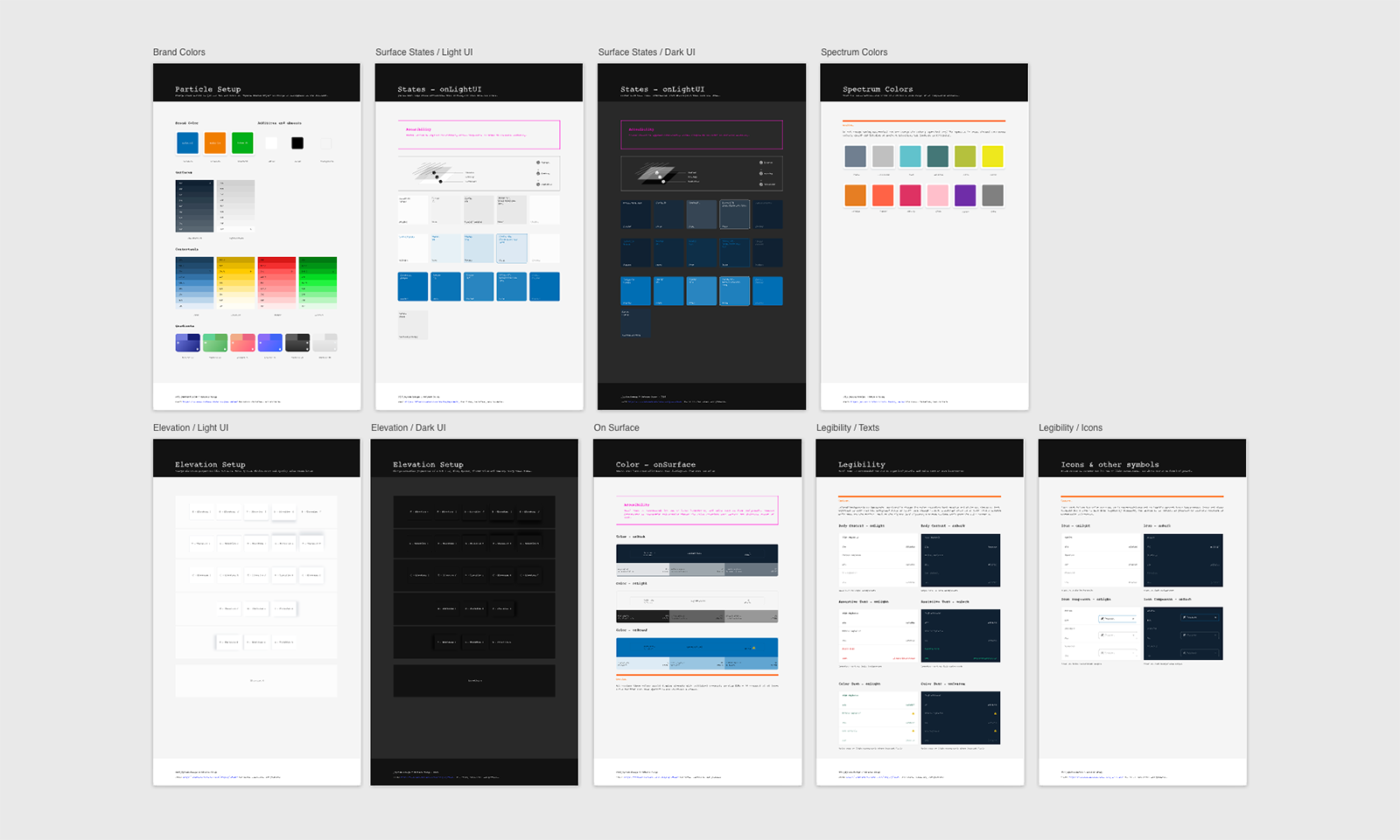
One of the key challenges was to have the product work across multiple brands with different colours, styles fonts, and logos. So we needed to build a design system.

We opted for a system based on Material, with our primary, secondary and tertiary colours, light and dark, and 9 different lightness of each colour. Coupled with Sketch plugin Camilo we were able to quickly adapt our design from one brand to another.

This is a complex topic and will be discussed in a separate article.

Verify

Test and Usability Studies

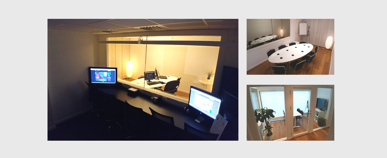
Finally a BETA version was released and it was unveiled to a small section of our players. We invited a handful of them to review the new site at Usability Partner’s specialist facility in Stockholm. The whole UX team sat behind the mirror for a full week while player engagement was analysed.

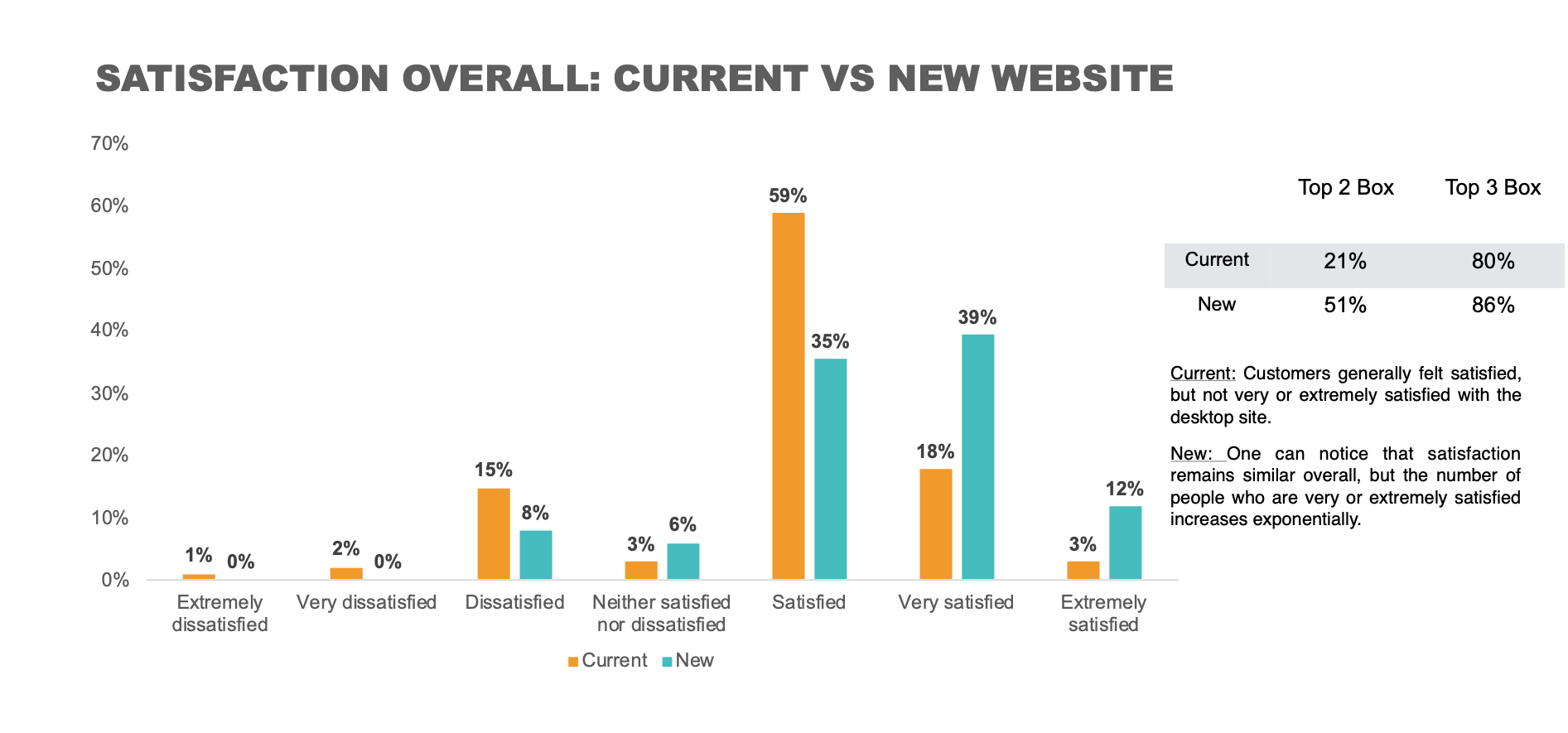
The feedback was generally positive, and highlighted areas we needed to improve on. Smaller problems arose like unreadable text sizes or colours, confusing icons, and other UI fixes.

It also revealed much larger issue such as the entire right sidebar was often not discovered at all, and most players didn’t understand how to claim their bonus.

The process was repeated for other brands. This would also give us feedback from different regions, as one brands tends to dominate its particular market. 

Further user tests were done for small features using Hotjar and Usertesting.com.

Many participants in the Usability Labs tests liked the simplicity of the new design, clarity of the start page and the interface was commented on the startpage not being too ’busy’. It was perceived as being easy to find your way around the interface (at least when doing basic things – although they said it could be more difficult when it came to things they weren’t so familiar with). Some mentioned the amount of text being used was not so extensive and that was appreciated.

The study by usability partners showed a SUS score of 81%, which was considered a success overall and the BETA site was rolled out to all players by market.

Our intention was to migrate all brands over to the new platform, which has dominated our department’s activity since the build. As I write this 4 years later, we are now close to rolling out a series of game-changing updates to both the UI and UX. Update to follow.

Awards

Casino Of The Year

Ask Gamblers Awards 2019

Best Casino Of The Year

Back