Using a third party based in Hong Kong the company wished to launch our online casino product in the underexploited Japanese market. Taking our casino product as a base, we sought to introduce a new brand aimed at the Japanese online casino segment and adapt it to our generic design system.
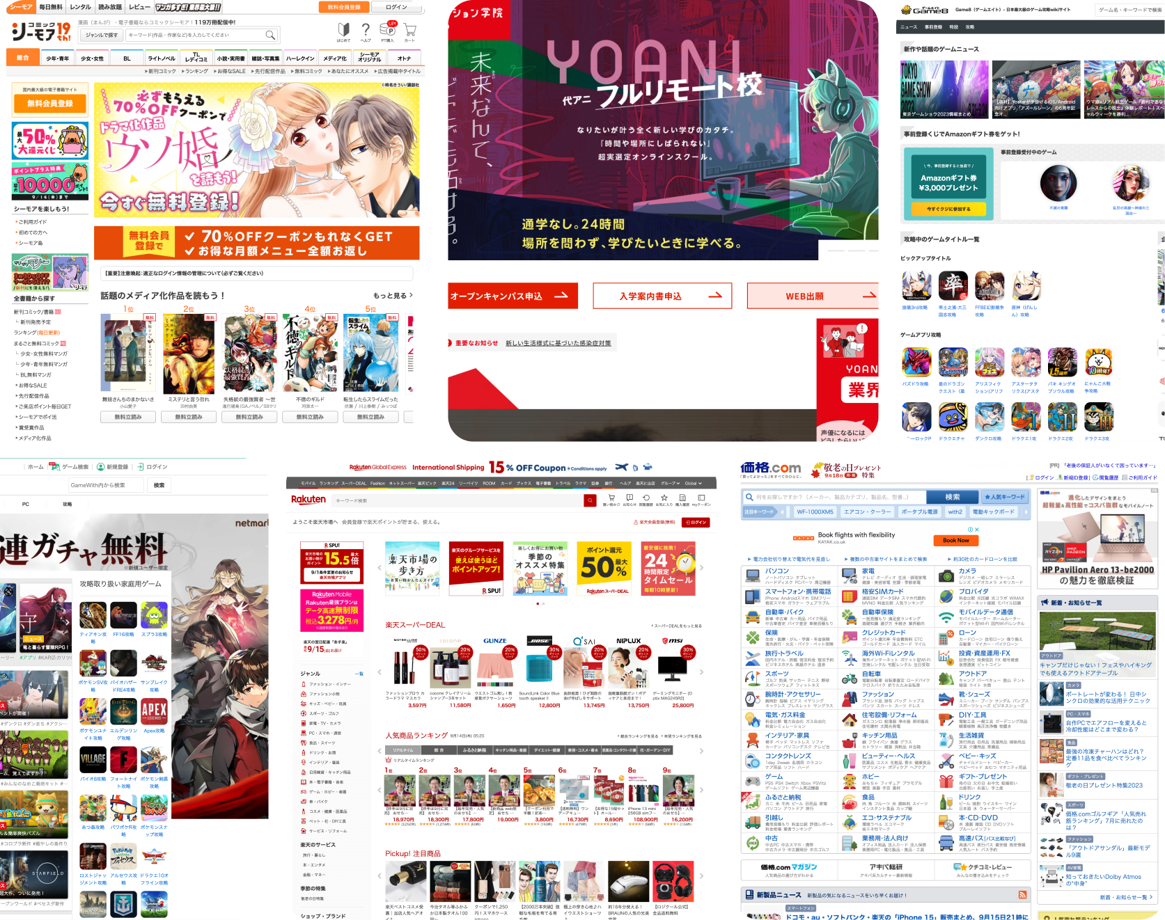
Japan’s traditional and contemporary architecture, as well as its books and magazines, have garnered admiration from designers around the world. However, when it comes to digital products, particularly websites, Japan’s design sensibilities often appear to lag behind, reminiscent of the web’s early days in the late 1990s. If you explore some of Japan’s most popular websites you’ll likely find:
- Dense, tightly packed text
- Small, low-quality images
- An abundance of columns
- Vibrant, clashing colors and flashing banners
There are several theories which attempt to explain why Japanese web design differs so distinctly from Western design:
Kanji and Language
- Character Comfort: Logographic-based languages like Japanese and Chinese can convey a wealth of meaning with just a few characters, which can appear cluttered to Western eyes but allow for efficient information processing.
- Lacking Emphasis: Japanese lacks italics or capital letters, making it challenging to create visual hierarchy, leading designers to rely on decoration or graphic text.
Technical
- Mobile Legacy: Japan’s early adoption of mobile web technology heavily influenced web design, particularly for small screens.
- Web Fonts: The lack of web fonts for non-Latin languages like Japanese and Chinese leads designers to use graphics for non-standard typefaces.
Legacy Software: Some users in corporate environments still rely on outdated software like Windows XP and IE 6, affecting web design choices.
Cultural
- Advertising Focus: Japanese companies often view the web primarily as an advertising platform rather than an interactive tool, leading to information-dense websites.
- Urban Landscape: Japan’s bustling urban environment influences web design, resulting in visually busy websites mirroring the chaos of Tokyo’s streets.
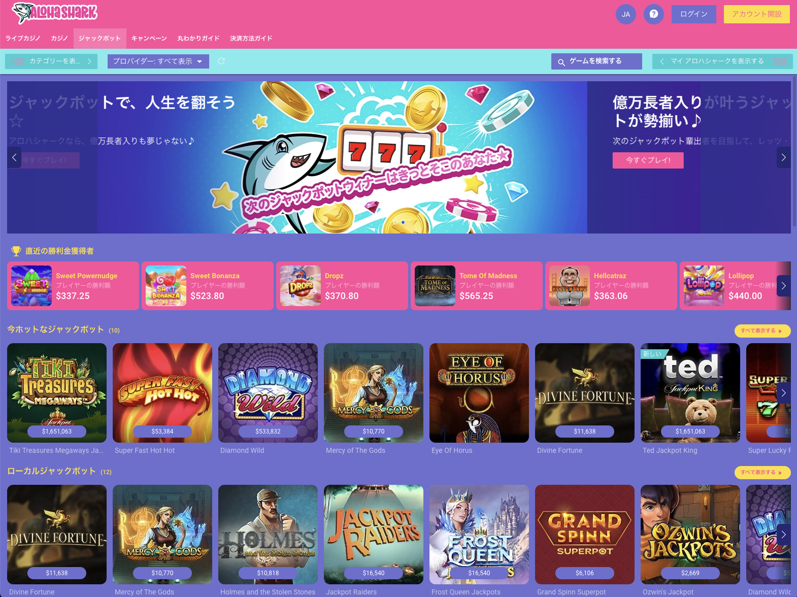
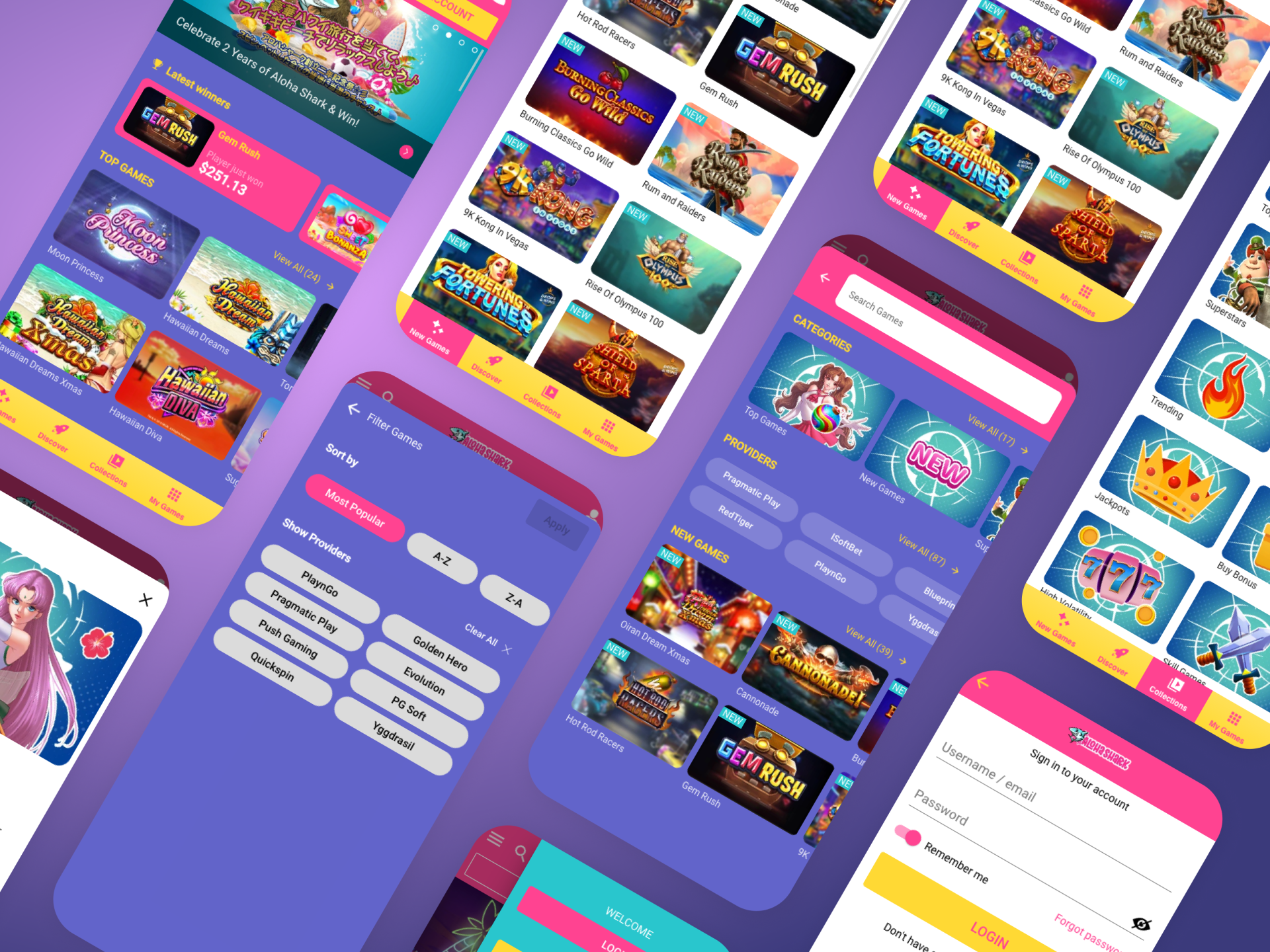
Our design team harnessed the vibrant elements of popular Japanese culture to craft a distinctive brand identity for the new casino website. Drawing inspiration from iconic symbols, such as a pair of Nike Air Classic trainers and an avid fascination with Hawaiian surf culture, we forged a unique color palette and logo that was bold, fun and dared to be different. The bold colours of the sneakers and the somewhat garish Hawaiian shirts well known from 60’s surf culture were merged to create a vibrant and fun palette. The logo was designed by our in-house branding team, and reflects Hawaiian culture in the form of flowers and bold pastel colours, with a cartoon shark.
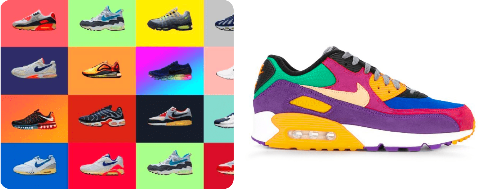
Once we’d defined the palette, myself, Mark (Lead UX) and Karl (Lead Frontend) wrestled it out in terms of how to apply it to the existing design system.
The most significant challenge was making such a garish palette workable in the context of a design system. It would later pose the same issues when we built a new DS. Other challenges included applying Japanese fonts, checking their readability and establishing whether or not the font looked good from a Japanese perspective. Thankfully the client was able to provide us with useful insights.
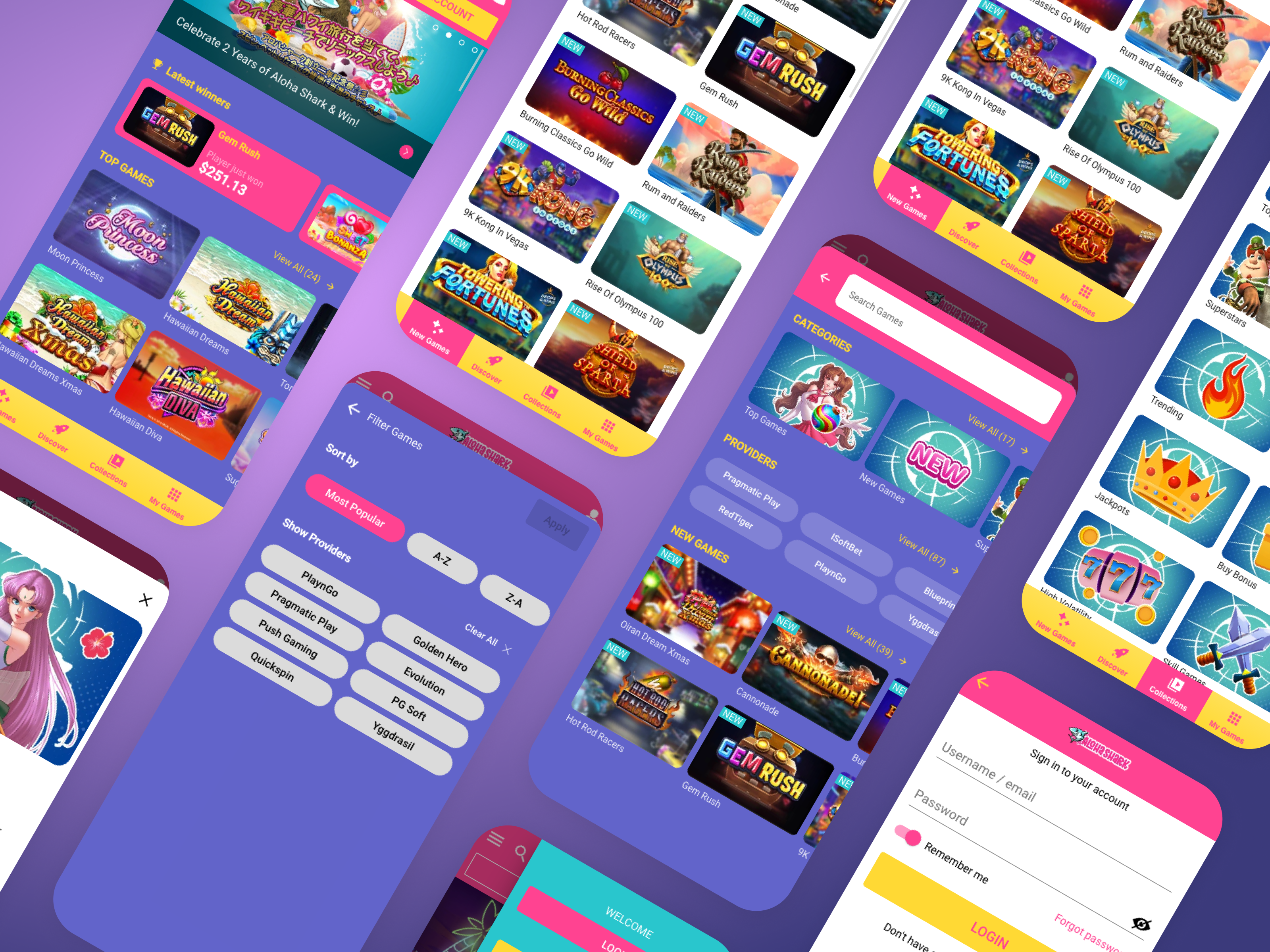
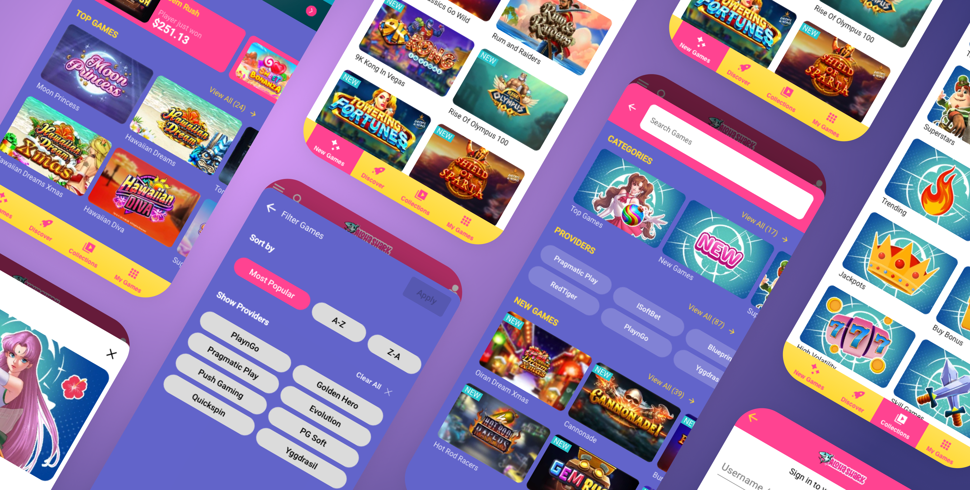
The image above is taken from the Sketch files, mobile version, hence the use of western characters instead of kanji. Below is a screengrab of the desktop version of the site.
